Showing posts with label die cut. Show all posts

Sunday, November 16, 2014

Football '14 Week 11: Do or Die (Cut).

       The game in the NFL is one of inches.  This cliche has been ridden into the ground so far it has come out the other side of the earth.  But cliches are cliches for only one reason: they are true.  The Saints face this brutal fact right now: they have to start winning close games and must make the important plays.  Want to know the difference between being a 4-5 disappointment (and yet somehow in first place in a truly crappy division) and being an 8-1 juggernaut?  Four plays. 
 photo dc3_zps06302f78.jpg

On opening night, the Saints led in the last minute of the game and let the Falcons convert a third down they should have stopped; they then lost in overtime.

 photo dc1_zps0af7868d.jpg

In week 2 it was literally deja vu: they led the Browns in the last minute and gave up a late third down conversion they should have stopped and lost in regulation on a last second field goal.

 photo dc2_zps121ec302.jpg

Week 7 against the Lions, they led by 13 points with 4 minutes to go and somehow coughed up the lead, including an impossibly stupid cross-up on a third down that led to a 75-yard touchdown play.  I consider this play the most unforgivable of all.  When you have a lead late, you are playing the clock as much as the other team, let them have all the 6 yard pass plays down the middle they want, you cannot CANNOT go for the ball and let a man score.  Rob Ryan should have been fired after this game.

 photo dc4_zps42585985.jpg

And finally, last week.  Leading by a field goal in the last minute, the secondary somehow loses track of the best receiver on the 49ers on fourth down and allow a 50 yard completion that gets the Niners into field goal range.  The Saints lose in overtime.  I am not even going to bring up the ridiculous call of offensive pass interference on a completed hail mary at the end of regulation that would/should have won the game.  This and the Lions play still make me so mad I now have to get up and pace.

 photo dc5_zps17b3bff0.jpg

Okay, I'm back.  So there it is, four plays.  The Saints are four plays from being 8-1 and are instead 4-5.  Sure, you can point to dumb turnovers and lost opportunities during the game but greatness can be measured best when the game is on the line.  Are the Saints an 8-1 team?  Obviously not.  Are they a 4-5 team?  Well, you are what your record says you are.

 photo dc6_zpsef9e27e1.jpg

I have a big batch of pulled pork and a sixer of Yuengling and I am ready to watch the Saints (hopefully) beat up on the Bengals - another team full of disappointment.  As you may have noticed from these posts, watching and enjoying football for me has not been easy this year.  If the Saints lose this one, you can look forward to a lot of hockey posts and longing for pitchers and catchers.  But I have faith that if this game comes down to one play, the Saints have learned their lessons and will make it.

Sunday, October 21, 2012

Football Week 7: Random Shiny!

      I have spent the last few months trying to sort out the miasma that is my football binders into something with the appearance of a collection.  The deeper in I get, the more messy everything appears to be.  I want to streamline things the way I have my baseball and (for the most part) my hockey collection.  I want nice nine pocket pages with a single theme.  I want my favorite players and cards well represented.  I want it to look like someone applied a modicum of thought to the whole thing.

That brings us to this couple of pages I found this morning.  They are kooky.  They are full of random cards.  Sure, random can be fun sometimes, but wow, these bring random to a whole new level.  I truly would like to know what I was thinking when these pages were created: "Hey! This one is kinda shiny...this one is die-cut...this one is die-cut and kinda shiny, I think I'll stick it in here!"  That would seem to be the maximum amount of brain power that went into this one:
Photobucket
Ahhhh, the late 90's and early aughts were such a wonderful time.  Cards with a patchwork of foil, cuts, see-thru, reflectors, refractors, and whatever the hell dufex is.  This page is glorious in its representation of that era.  I am almost tempted not to change this one at all.  It is so organically haphazard that it almost seems planned.  I really wish it was.  The scan does not do it justice either.  That Tamarick Vanover (great name alert!) in the upper left is a Trophy Collection card. The Jim Harbaugh (current 49ers coach) in the middle left is a Stadium Club Dot Matrix parallel.  Yeah, maybe those card styles mean nothing to you, but in real life, they are sooooooo shiny.  The scans of the Kevin Greene and Edgerrin James on the right kinda show how shiny these cards are.  I could probably blind drivers from 50 yards with that Greene card.  The bottom row is a a trio of foil drenched die cuts.  Upper Deck really loves that little curved notch they used on the Kerry Collins card; they used it as recently as 2010. 

This page has a companion.  Unfortunately, it is not nearly as connected by its randomness:
Photobucket
It would seem that with this page, I really was just sticking cards in the pages.  The Rocket Ismail in the upper left is a Members Only Stadium Club cards and is very shiny (shouldn't he be wearing a jacket?) and apparently, I went completely 5th grade and put in a couple of Marion Butts cards.  That Joey Harrington card in the center square is just as epic as it would appear.  All foil and lightning bolts, it looks like ol' Joe is getting his comeuppance for years of sucking by being electrocuted.  Too bad that insert set was only 6 cards, because a design that dramatic deserves a page of its own.  Sadly, it is downhill from there for this page.  There is a Rick Mirer card that is 1 out of 90,000 - wow, so limited - and a couple of Raiders cards, though one of them is an Upper Deck hologram card of Fred Biletnikoff.  Then it looks like I just stuck a Tom Jackson card in for no reason, since it is neither shiny nor die cut nor a parallel nor anything that would tie it in with the rest of these.  Last but not least is that Earl Campbell card in the middle bottom, which is from 2005, proving I have looked at this page in the last couple years and did nothing about it.  That said, Earl Campbell was a monster.  Never saw him play?  Go take a look...he was amazing.

Friday, March 23, 2012

Parallels.

       I'm not entirely sure when the card companies lost their mind.  It might have been in the late 80's, when their printing presses got more work than Bill Cosby.  It was abundantly clear, however, that by the early 90's, they had gone insane and it was an absolutely collective disease.  That disease had a very simple yet haunting name: parallels.  And the road to that illness was paved with gold...gold foil to be specific.  In 1992, Topps did two things to their base set, one of them brilliant and one of them practically the downfall of all cardom.  The first was they printed their flagship set on bright white cardboard, an excellent move.  The second was they made parallel inserts of the entire base set with gold foil on them and randomly inserted them into packs.
Photobucket
They also had a contest that you could enter to win more gold foiled parallels.  Trouble was, the contest was easy to win because of a printing flaw in the contest cards so Topps had to print more gold cards to meet demand.  This made a parallel set to their parallel set, and, oh, it was a winner:
Photobucket

Then to perpetuate the madness, Topps took things one step further in 1993 and started to insert the gold foil parallels one per pack:
Photobucket
I never caught parallel fever bad enough to try and build an entire set, but for some reason, I have the first and second series of 1993 represented with pages, maybe it was because two different series were new at the time, I have no idea:
Photobucket
1994 brought more of the same from Topps and their flagship brand:
Photobucket
They added the concept of Black Gold at this point, which I do not have a page of and they weren't parallels but inserts, so let's just look at some more 1994 Gold cards since I once again have a series one page and series two page:
Photobucket
Exhausting?  We haven't even started...

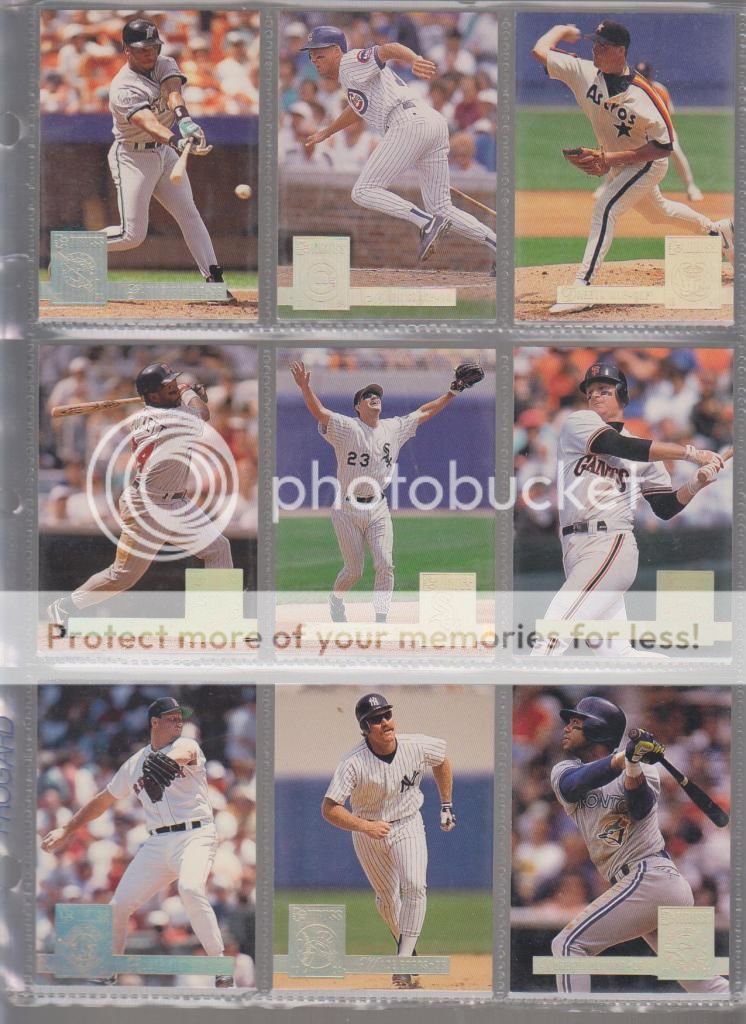
Upper Deck, feeling left out, looked at Topps' madness and said "me too!" Their 1993 was almost perfect in every way, including the fact that it did not have parallels.  Then in 1994 Upper Deck came up with their Electric Diamond parallels.  They weren't gold, they were electric, whatever that is supposed to mean:
Photobucket
That page is ugly in its attempt to be all inclusive.  Looking at the aesthetics of that page, I should be ashamed of myself.  Upper Deck repeated the Electric Diamond idea in 1995, but the difference was so slight, I have never bothered with a page of them.

One place Upper Deck did get all crazy with the rare metals was with their Collector's Choice set.  Starting in 1994, they started with Silver and Gold signature parallels:Photobucket
The Gold is much more rare than the silver, which I suppose is fitting:
Photobucket
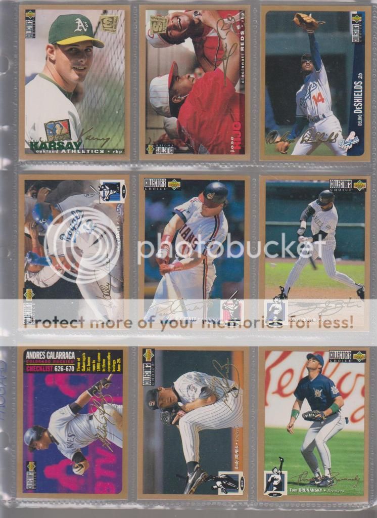
Collector's Choice set had special editions and all sorts of nonsense, keeping it all straight makes my head hurt:
Photobucket
Photobucket
Photobucket

Donruss would eventually take the notion of the parallel farther than anyone, but they started out pretty nice.  The 1992 Leaf base set had silver borders, but the parallels were black with gold foil and they look sharp:
Photobucket
The 1994 Donruss base set had a rainbow parallel, which takes shiny to a whole new level:
Photobucket
By the late 90's, the Donruss sets were a horrifying menagerie of parallels, numbered parallels, proofs, artist proofs, die cuts, and the like:
Photobucket
Photobucket
Photobucket
Photobucket
And don't get me started with what they did to the Leaf set.  A person could go mad just trying to look up one parallel card from the 1998 Leaf set alone.  I have none of those cards represented just to avoid the temptation.

Fleer kept up with the Joneses with their Tiffany parallels:
Photobucket
Their '96 & '97 sets were already a little different in that the base cards were matte finished and the inserts were shiny.  In the end, though, their heart just wasn't in it...

But Fleer Ultra had Gold Medallion...and boy, is there gold in them thar cards.  Gold medallion over the years varied in it's presentation from full gold:
Photobucket
Photobucket
To hard to tell it's a parallel:
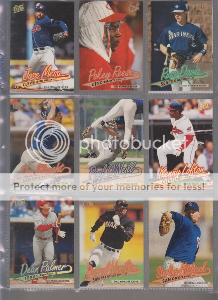
Photobucket
To die cut:
Photobucket
To die cut and golden:
Photobucket
Still with me?  Are you paying attention?  There will be a written quiz...

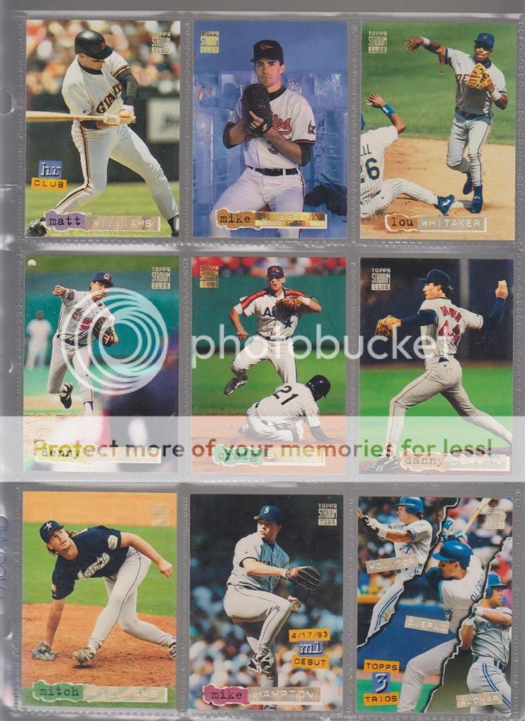
Topps eventually branched out from the base set and took parallelitis to its premium set Stadium Club.  In 1993, the shiny "1st day issue" block first appeared:
Photobucket
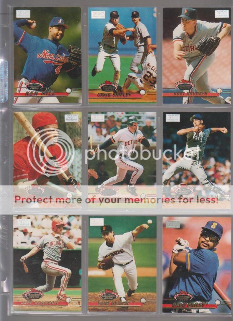
They continued in 1994:
Photobucket
Plus, 1994 also brought some golden rainbow shiny of their own:
Photobucket
1995's Stadium Club parallels combined the then-already worn out phrase "Virtual Reality" and the idea of continuing the 1994 baseball season from where it ended on August 12:
Photobucket
The cards in question featured stats on the back as run through a computer simulation.  The 1995 Topps set also had a parallel that hinged on this concept, but you will have to come back on Sunday to see all about that one.


Post script. I just didn't have the energy to do all of Score and Pinnacle and Pacific and go into the late 90's and the numbered parallels of the 2000's....heck, it looks like this will have to become an ongoing series.  But believe me, Score was also on the gold bandwagon:
Photobucket
As I have shown with this post, parallels can be quite frustrating, but sometimes, they can almost induce seizure...take these 1997 Score Artist Proofs:
Photobucket
Wow.  Just, wow.