Monday, September 30, 2013

Football '13 Week 4: Thank God It's Monday.

       I worked 12 hours today.  Needless to say, I am exhausted; Mondays can be so cruel.  I have showered, put on my pajamas and laid down on my couch.  I truly believe the goal of any work day, no matter what your profession, is to be able to appropriately take off your pants.  Plus, I get the rare treat this evening of being able to watch my Saints on Monday Night Football.  This makes today much much better.
 photo mnf9_zpsa4a5e08b.jpg
I have no idea where I got that page of cards, but they are pretty cool.  They are the usual raised embossed Action Packed kind of cards.  These get extra cool bonus points for being all gold and shiny.

I am too tired to write a coherent post, so let's just look at some Drew Brees cards:
 photo brees1_zpsb868b318.jpg
Oh, my mother is in the Superdome this evening, part of her usual autumn sojourn down to New Orleans.   Lucky her.  She called me half an hour ago to taunt me.
 photo brees2_zps12732f46.jpg
These are some pretty random cards and I am in no condition to try and make sense of them.
 photo brees3_zpsf4d5dd53.jpg
This page features Dan Marino, legendary quarterback of the Saints opponent tonight, the Miami Dolphins.  Both teams are undefeated and playing very well - some would say over their head.  Hopefully, the sound and fury of the 'dome on Monday night will make the Dolphins drown.  Wow. That mixed metaphor went nowhere.  I think I will order some dinner and just watch the game before I murder the English language in cold blood.

Wednesday, September 25, 2013

A Retraction and Apology.

       Three weeks ago, I wrote this post.  It was well deserved, mostly because of the first three starts Daisuke Matsuzaka made for the Mets...take a look.

 First 3 starts:
Date      Opp      GS  W    L    IP    H    R   ER  BB K  ERA  WHIP
Aug 23    DET      1    0    1    5.0    6    5    5    1    4      9.00  1.40
Aug 28    PHI       1    0    1    4.1    6    4    4    4    5      8.31  2.31
Sep 2    @ATL     1    0    1    3.0    7    6    6    2    3    18.00  3.00

That's about as ugly a three starts as you could want.  Plus, he was taking about 45 seconds between pitches; it was simply awful to watch.  Somehow, for reasons I cannot quite fathom, he stayed in the rotation.  Well, then this happened...

 Next 3 starts:
Date      Opp       GS  W    L    IP    H    R   ER  BB K  ERA  WHIP
Sep 8    @CLE     1    0    0    5.2    3    1    1    3    6    1.59    1.06
Sep 14    FLA       1    1    0    7.0    2    1    1    1    3    1.29    0.43
Sep 20   @PHI    1    1    0    6.0    4    4    2    3    6    3.00    1.17

And then today he went into Cincinnati and did this...
Sep 25    @CIN   1    1    0    7.2    4    0    0    2    6    0.00    0.78


You have reason to smile, Dice-K, it is not often I eat so much crow.  I will give credit where credit is due, however.  He listened to his coaches and manager, pitched much faster and sharper, regained his former command, and now could even get a long look for next season.  謝るよ。  Shazai.

Tuesday, September 24, 2013

We Rip What We Sow.

       When I was a kid my mother always used to say to me "go ask, all they can do is say no..."  I have kept that little aphorism in my head most of my adult life.  Really, it's a very positive little piece of advice.  It has rarely gotten me into trouble and it often helps me and opens doors I never would expect to be open.

Here is a nice little example of that advice in action:
 photo gc1_zps446b65b7.jpg
Last week I was up late with my usual insomnia and I decided to kill some time surfing eBay.  I went through my saved searches and while I was checking out Gary Carter cards, I saw he was featured on Allen and Ginter rip cards this year.  The couple that I saw were pretty cool, so I started narrowing my searches down.  One thing I do like to do with my favorite players is see if their uniform numbers are available.  After plugging in "08" I didn't find anything, so I checked the completed items.  I saw that about a month ago, indeed a number 08/25 was posted with an outrageous buy it now price.  I clicked on it and also saw that it hadn't sold.  So I dropped the seller a line and asked him about the card and asked if it was still available.  He got back to me right away (he must be an insomniac too) and told me he decided to rip it.  I told him, oh, that's cool, and asked him what he got inside.  He gushed proudly that he got a redemption for a game used piece.  We pleasantly emailed back and forth a few more times and I got around to asking what he would want for the ripped card.  He told me, well, I guess $20 would do the trick.  Now, I had seen other ripped Carter cards going for $25-$30-plus that a) weren't serial numbered 08 b) had him on the Expos and not the Mets and c) had the usual exorbitant shipping costs.  I very politely told him yes and silently squealed with glee as I sent him the money via paypal.  I think my friendly demeanor and interest in what he had pulled from it softened him up.  That or he was just a very polite dude.  Either way, he securely mailed it right away and now this tremendous card is mine. 
 photo gc2_zps2a480b07.jpg
tl;dr - I scored this awesome Gary Carter card for $20 by asking about it and being polite.

Monday, September 23, 2013

Yastrzemski.

       I am not a great speller but as Mark Twain said: I have no respect for a man who can only spell a word one way (or not).  If it weren't for the little red squiggles on the bottom of the words, I would be in big trouble.  In the age of typewriters, my editors would curse me, hate me, and eventually demote me to the sales department.  This opening sort of introduces our subject today, Carl Yastrzemski.  As someone who is both of Polish decent and multi-generations of Red Sox fandom, needless to say Yaz is a personal favorite.  I was born in Albuquerque NM and that is the longest city I can spell without thinking.  Similarly, because of my Boston and Red Sox roots, Carl Yastrzemski is the longest baseball player name I can spell without thinking.  I once threatened to show off my Yaz collection and considering the Red Sox honored him outside Fenway on Sunday with a new statue, it seems an appropriate time to show it off.

First, let's look at the pages:
 photo yaz01_zps76a9bc5e.jpg
An interesting mix of faux vintage and very early all-time greats cards.  That TCMA all time Red Sox cards has a great stadium light post in the background.  It is also hiding a 1987 Hygrade Yaz. The 1990 Glossy all star in the middle is doubled up with the 1984 Glossy all star.  I probably should have scanned the back of this one, huh?  I am thrilled with how nice that 1986 Sportsflix card scanned; rarely do you get such a nice representation of a single picture much less the best one of the three.

Here we have an orgy of faux vintage goodness:
 photo yaz02_zps95579f5f.jpg
I was once very confused about the logo on that Golden Moments card.  Turns out, it is considered a Red Sox logo because they used the red hats in the mid to late 70's - and the 'B' was blue on those (see the top two cards of this page for reference).  The more you know...

We now get to some player era cards:
 photo yaz03_zps35712e05.jpg
That 1983 Topps is not just one of my favorite Yaz cards, it is one of my all time favorite cards period.  It is also his last Topps base card - pretty damn good way to go out.  I am pretty sure that glossy mail in all star card in the middle is from the same series of photographs.  The photo on that Drakes Big Hitters card is wonderful.  It shows a full Fenway behind Yaz as he leaves the batters box.  The crowd in that 1982 Fleer card celebrating his 3000th game?  Not so impressive.  Proof that Red Sox nation was not always so strong.

Some more early 80s's stuff.
 photo yaz04_zps8554520b.jpg
Seeing double?  Lots of 1981 cards on this page.  And somehow, a couple of faux vintage cards wondered on to this page.  I should probably reorganize my Yaz pages...  The photo of him giving the raspberry on the American Pie card is quite amusing in an outtake sort of way.  I wish they'd use more types of portraits like that on those reprint/faux vintage cards.

Ah, some gritty dark cardboard 70's Yaz cards:
 photo yaz05_zpsbadef367.jpg
Topps loved to celebrate his 1967 season, huh?  There are four of them total on these pages, two of them alone on this one.  I remember thinking as a kid how old Yaz looked on his 1978 and 1979 cards.  I am now about the age Yaz was in the pictures on these cards. Funny how not-so-old he looks on them now.  I have always been a big fan of both his 1977 Topps cards.  I don't recall how I got that 1974 Topps card and I am still not sure if that is a b.b. hole or a pushpin gouge.  Either way, that card was well loved or despised greatly by someone back in the day.  The 1972 Topps has a great spring training shot and the 1970 Topps has a classic old Yankees Stadium pose.  My, but Yaz has some fantastic cards.  And if you are a hardcore devotee of Starting Nine, you know there is one more Yaz card hiding amongst my pages.  

Alright, let's go to the boxes for some more shiny and vintage stuff:
 photo yaz06_zpsa6eef490.jpg
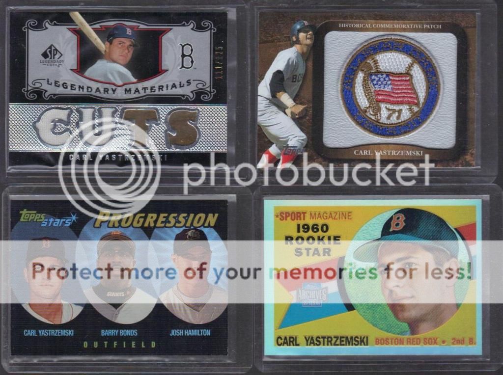
That is the only game used Yaz I own and I pulled it from a box I bought when that product was new.  I also pulled that Yaz manu-patch card back in 2009.  I have good Yaz karma when it comes to these things, I suppose.  That Topps Stars Progression card has quite the trio on it.  I owned a 1960 Yaz rookie years and years ago and it was sold long ago in the big gotta-pay-the-rent purge of the early aughts.  My shiny 2001 Archive Reserve reprint will have to do in its stead.

Some shiny numbered commemorative cards:
 photo yaz07_zpsd48e15d1.jpg
Oddly, that Passing the Torch card has no one on the other side.  I thought the whole point of that set was to have players who passed the torch to other players.  Shouldn't Jim Rice or Ted Williams be on the other side of that card?  That 3000 hits club card is both die cut and too thick for the top loader it is in, thus it's crookedness. 

Some more faux-vintage:
 photo yaz08_zps3c951372.jpg
I am not 100% sure why these are in top loaders and not in the pages.  Man, I definitely need to clean up my Yaz collection. 

A foursome from the 1999 Fanfest:
 photo yaz09_zps339ba467.jpg
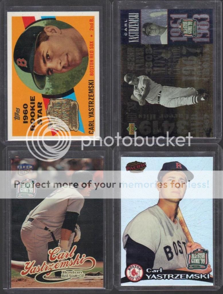
The 1999 All Star game was at Fenway and I went to the Fanfest in the Hynes Convention Center.  It was the first one I had ever gone to (but not the last).  You had to buy a certain number of each companies pack and trade the wrappers in for their Yaz card.  As you can see, I obediently did all four.

A few more inserts:
 photo yaz10_zpsed070756.jpg
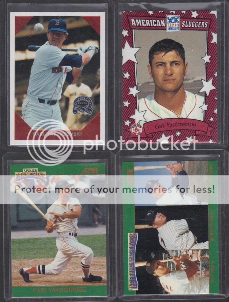
That Fleer one in the upper left should have the subtitle "keep your eye on the ball." Those Score cards on the bottom were some of the earliest retro insert cards.  The one with Musial and Mantle is creatively titled 6-7-8.  If I have to explain that to you, you are reading the wrong blog.

OK, I lied, a couple more inserts and finally some real vintage:
 photo yaz11_zps6f82b6cd.jpg
I once owned a beautiful 1971 Topps Yaz.  It was clean, pack fresh, and well centered.  If I believed in such things, I could/would have gotten it graded.  I sold it on ebay relatively recently because I finally abandoned my overwhelming urge to build the '71 set.  There is a much better looking 1974 Topps than the one in the pages.  That 1973 Topps card is Milhouse's favorite.  If I have to explain that to you, we cannot be friends.

One final batch of Yaz vintage cards:
 photo yaz12_zps567cce3d.jpg
As you can see, my vintage Yaz collection is not as impressive as my adoration of him may have suggested.  Along with the rookie and the 1971, I once owned a 1961, 1962, and 1965.  Alas, they are all gone.  But let's focus on what I have rather than what I don't.  Yastrzemski was a monster in the late 60's, setting hitting marks in an era when no was was hitting.  Therefore, he shows up on a lot of league leader cards.  In fact, he shows up first on the three big ones in the 1968 set due to his aforementioned monster 1967 Triple Crown year.  It took until last year for that to happen again.  My love of World Series cards wouldn't let me get rid of that epic 1968 card (also seen above in Archives reprint form).  And of course, my eternal affection for oddball cards wouldn't let me sell that 1969 Topps decal.  I am still not sure if they are like stickers or rubdowns or tattoos or what.  While they are not super rare, I am not willing to find out.

Sunday, September 22, 2013

Football '13 Week 3: Shiny!

       I have my snacks and adult beverages.  I have the Saints and Giants (and Mets) all on at 1pm.  I am still in my pajamas and there is a beautiful first-day-of-autumn breeze blowing through my living room.  Life is pretty good right now.  This is easily one of my favorite kinds of days, so let's look at my favorite kind of cards...shiny!!!

2012 Bowman Platinum:
 photo tp9_zpsf778861d.jpg
These are the rare cards that actually scan better than they look in real life.  Pay no attention to the man in the lower right hand corner (gotta get a replacement for that one).

2001 Topps Archive Reserves:
 photo tarc9_zps49b63bea.jpg
This set was done in the early aughts faux-vintage retro reprint phase of card companies.  They did two years of baseball, they only did one year of football.  You don't see the name Elroy a lot anymore - I think the Jetsons killed it - and he also had one of the best nicknames ever, Crazy Legs. 

2005 Topps Chrome Gold inserts:
 photo gold9_zpsb564e9d9.jpg
I have no idea if they did refractor versions of these cards, but it would hardly matter.  They are very dynamic all on their own.  Vegas baby, Vegas!  This is the rare page with a mix of current and retro players.

2000 Bowman Reserve:
 photo bowr9_zps584dedee.jpg
This is an all refractor type set that is the exact opposite of the Bowman Platinum above; no scan I have ever seen does these justice.  It's like they put extra rainbow shininess in the mixture before they went to press.

1998 Topps Gold Label:
 photo gl9_zps44fe2561.jpg
There are a million variations to these; I am pretty sure that was their only reason to exist.  It's like they all sat around in Topps HQ and said "hey, how infuriating can we make a set to collect?" and came up with these beauties.   Of course, they then outdid themselves and came up with these, though they never did that design in football.  I have no idea if that is a good thing or not.

1994 Topps Football Special Effects:
 photo t94_zpsf39e8e02.jpg
I always found these parallels fascinating.  It features a shiny bit that I had never seen before or since.  The player name is done in silver glowing letters and there is a plastic sheen of little checkerboard lens flares over the whole thing.  They never did this to any other set and I wonder why (update: I just looked it up and they also did it to Premiere Hockey that year).  Maybe it wasn't received well?  Maybe it was too expensive to do?  It is a shame, because it looks damn cool. I once considered building the whole set of these, but decided a single page would more than suffice.

1993 Stadium Club:
 photo sc1st9_zps364e2bed.jpg
Look! Little tiny squares of shiny.  Remember when little tiny squares of shiny were reason to get excited?  Now little squares of fabric don't even get people excited.

1998 SPx:
 photo holo9_zpsbe342bba.jpg
Die Cut! Shiny! Holograms! So 1990's, it hurts.

1996 SP:
 photo sp9_zps51bde5dc.jpg
This is a great example of a set that is deceptively shiny.  There is no extra foil or refraction or anything else going on, but the texture of the borders and the darkened backgrounds make everything stand out a little extra.

1994 Upper Deck Electric parallels:
 photo ele9_zpseb0d6b72.jpg
It's electric, boogie woogie woogie!!!

1991 Upper Deck Game Breakers:
 photo gb9_zps4b042872.jpg
This is the entire nine card set -- I love it when that happens.  These are nothing but shiny.  Did Upper Deck fall in love with holograms in the early 90's or what?  My scanner does a pretty good job with these.

1998 eX football:
 photo ex1_zpscc9c8b54.jpg
Talk about a 90's card maker's wet dream...half shiny, half clear plastic.

1998 Fleer Brilliants Blue parallel:
 photo fb9_zps03cd0a97.jpg
With a name like "Brilliant" you think it would be a lot shinier.  The blue parallel at least adds a little interest to the background, the regular issue was just flat silver.  I'm not sure why I included this page.

1998 Flair Showcase:
 photo fl9_zps3372626c.jpg
Unlike those lame Brilliants above, these are so well done.  The background is in one solid shiny muted color and it makes the foreground picture pop.  Throw in the simple design elements and font and you have well hell of a good looking card.

2004 Press Pass Big Numbers inserts:
 photo bn9_zps3de1695b.jpg
This is one of the first football pages I ever put together and it is exactly the way I made it nine years ago.  Larry Fitzgerald turned out to be a pretty good player, as did Will Smith (this one, not this one). The rest?  Very hit or miss, though it is a shame that Jarrett Payton (Walter's son) never got much of a chance.  I was really rooting for him.

2007 Score Atomic parallel:
 photo sa9_zps2187083f.jpg
On these, the shiny is done in a series vertical streaks.  They seem to have been influenced by the credits in the movie The Matrix.  With three games going with high interest now and none the rest of the day, maybe I should watch that, I mean, come on, anything is better than watching the Jets.

Thursday, September 19, 2013

They Arrrrrr Goin' For It, Matey.

       I do not like the sports teams of Pittsburgh.  The Steelers seem to think they are the best team ever, when before 1970 they were, quite literally, the worst team ever.  Six championships in 40-odd years is impressive, but forgetting the 40-odd years before that seems selective at best and delusional at worst.  The only thing I like about the Pittsburgh Penguins is their cute little logo.  Every other single thing can die in a fire.  And that brings us to the Pittsburgh Pirates.  The Pirates replaced the Cardinals in the early 90's as my most hated team.  Sure, the Cardinals certainly had more hateable players, but the Pirates were far more infuriating - quality over quantity, I suppose.  It was a joy and a comfort to me that they have been invisible for the last 20 years.  Now, suddenly, they are back.  After a couple of near misses the last couple years, they are loaded up and ready to make a run to and through the playoffs.

Currently, they are led by NL MVP candidate Andrew McCutchen:
 photo p0_zps7af71b2f.jpg
He is a fine enjoyable player to watch, except for the uniform.  I look forward to 2018 when they trade him because he wants too much money (of course, it will probably be to the Yankees...yuck).

The embodiment of my hatred for the Pirates can be stated quite simply:
 photo p3_zps10d8a6d9.jpg
Most people hate Barry Bonds now.  Like some kind of music loving hipster, I was a Bonds hater way before it was cool; my dislike for him started his rookie season (1986) and never waned. 

I have to admit, I didn't always hate every single Pirates player.  Willie Stargell was pretty awesome.
 photo p1_zps4d02b24d.jpg
He won the MVP in 1979 as a fat 38 year old.  That is a feat I can get behind.

If you have read my required posts, you know that I am also a huge fan of Roberto Clemente:
 photo p2_zpscee36e5f.jpg
I covered this a while back.

The most striking reason I hate the Pirates, other than the fact that they stole 2 or 3 division titles from the Mets, is they gave the world - and more specifically the Mets - Bobby Bonilla.
 photo p4_zpsf92094fa.jpg
This is the only Bonilla card I have highlighted anywhere in my pages and that is only because I love the look of that insert set.  The worst part of the saga of Bobby Bo?  Because of the Mets stupidity - or Bonilla's incredible business acumen *eye roll* - he will be getting over a million dollars a year from the team until 2035.  Yes, I am probably just jealous I am not clearing all that cash for doing nothing myself, it's just that the Mets make me sad sometimes.

So why spew all this hate for the Pirates?  I mean, they are gonna make the playoff after two solid decades of utter futility after all.  Well, I am not wishing them well nor am I rooting for them, but...
 photo p_zpsf954493d.jpg
Today, September 19th is International Talk Like a Pirate Day.  And while I think I have certainly made my point that I hate baseball Pirates, I love plank walking, keelhauling, sword fighting, ship ramming pirates.  So raise the mizzenmast and a cup of grog and tell your mateys you be lovin' them today...and root for the Red Sox in the playoffs.

Sunday, September 15, 2013

Football '13 Week 2: Pajama Game.

       I like to take Sundays off.  Not because of any biblical edict, mind you, simply because, as someone who used to work seven days a week (and on the wrong side of 30), I have grown to appreciate the value of 24 hours to reset your batteries.  These days I work more sporadically - sometimes 3 days a week, sometimes 6 days - but I do enjoy staying in my pajamas all day and watching sports (or bad movies) once a week.  During football season, the Sunday day off is non-negotiable.

Since they haven't made an insert set of players in their pajamas (yet), I will give you the closest thing I could find, a 1992 Lime Rock set of Saints cheerleaders, the Saintsations:
 photo ss9_zpsa73160ec.jpg
Of course, 20+ years later, these outfits look downright Puritan for NFL Cheerleaders.  The 80's hair is also, as always, a hoot.

I haven't bought much 2013 football product yet.  Topps did drop some Archives very early this year and I picked up a lot on Listia and made a page:
 photo ta9_zps07b10bf6.jpg
The 1976 Topps is one of my faves.  I think they have reused the 1959 design a few too many times, though.  I find it a little odd that they used 1985 and 1986 designs, since those years are back-to-back (obviously), but the designs are so different, I guess that doesn't matter much.  I am in the minority of kinda liking the 1986 design; I never much cared for the 1985 look,

This is (I believe) the first time Topps has done Archives for football since 2005:
 photo ta059_zpsbeb49fc8.jpg
See? There is the 1959 set again.  Also here is the 1984 set (yay!), the 1975 set (double yay!), the 1971 set (meh), the 1966 (double meh - that design worked better for hockey), and my favorite, the 1962 design.  I really really need to make a page of that one. 

So on my glorious pajama day off, what am I wearing? (no, I am not coming on to myself) This page offers a hint:
 photo gleason9_zpsc39565f0.jpg
OK, it was not much of a hint and it isn't a Deuce #26 jersey so I will tell just you.  On this page is the rookie (and only card ) of Steve Gleason - it is the middle left card, he is on the right of the three.  Gleason would have slipped through the cracks of even the most astute fan as an 8 year backup who wasn't even drafted.  Yet, he got himself a marvelous claim to fame in one tremendous play: he blocked a punt in the first quarter of the first game back in the Superdome after Hurricane Katrina.  This was a magical moment for a city that truly needed a magical moment.  I was at that game and up to that point, that block was the loudest sound I had ever heard.  Sadly, tragedy has struck Steve Gleason and he has been battling ALS (Lou Gehrig's disease) since at least 2011.  He has become a very outspoken champion for research and has been very visible in public the last couple of years despite his declining health and physical condition.  When I was in New Orleans last week, I bought one of his organization's shirts and while I normally would never pay full price for a sport shirt, I felt that since all the money was going to his charity, I would make a rare exception.  While I doubt many of you would want a #37 shirt like mine, I think it would be a marvelous idea if you donated to his charity.

So right now I am getting some laundry done while baking an apple crisp (damn, I love autumn).  I am switching between the crappy early games and the Mets game waiting for the Manning bowl to kick off at 4:25.  I even went to the store to get ice cream and no, I didn't change out of my pajamas to do it.  I take my days off that seriously. 

Thursday, September 12, 2013

Mail Call: Hell Freezes Over.

       I got back from New Orleans late afternoon on Wednesday and after I dropped my bag and realized it took me longer to go from Brooklyn to New Jersey than it did to go from NOLA to JFK, I dove into the high pile of mail sitting on my dining room table.  Amongst the third class ads and glorious PWE full of Listia goodness was a little pink slip from the post office.  These are usually left for large packages or the like, but this particular one was for a certified letter.  My brain went through the long list of people and creditors that might send me such a thing, but my mind drew a blank.  So I had to slog down to my local post office today, which features a counter staffed by three ladies I refer to as Fran Drescher and Tweedle dumb and Tweedle dumber.  Without getting further insulting, I think those names cover what I think of them and their attempts at customer service.

     So I hand over the pink slip and when Tweedle dumber returns, she has this envelope...


I see that it is a jiffy pack but I am not expecting anything I ordered on eBay to come in such a manner.  Then I noticed the return address is Duryea PA and that means only one thing: Topps.  After a split second of calculation, my brain shouts in joy: oh my god! oh my god! finally!!!!  I remain calm and quietly sign to receive a card I have waited nearly two years for:


I'll admit it...I had given up hope.  I didn't think it existed.  I was willing to just roll over and accept that I was never getting this card.  The couple of emails I had sent went unanswered.  Eventually, years later, they would send some replacement card of a prospect I had never heard of that played for Milwaukee or Kansas City that never gets above A ball.  I was resigned to the fact that I was never going to get my beautiful shiny Matt Harvey autograph.  And yet, here it is. Maybe with his injury, he had time to sit down and sign his backlog of cards?  I dunno and I don't care.  The only real issue I have with it is that on they back they compare him to Mike Pelfrey.  Yikes.  Luckily, I will never look at the back and if I do, I will just mentally replace that with Tom Seaver.  Ugh, 2015 is a long time away. 

Monday, September 9, 2013

Revolution #9.

Number 9, number 9, number 9, number 9
Number 9, number 9, number 9, number 9 photo tw1_zps4038f074.jpg
Everyone of them knew that as time went by
They'd get a little bit older and a little bit slower.
 photo tw2_zpsbac94c8b.jpg
Your father's giving it diddly-dee
District was leaving, intended to die, Ottoman
Long gone through.
 photo tw3_zps60b7fa4b.jpg
They may stop the funding
Place your bets
The original
Afraid she'll die
Great colors for the season.
 photo tw4_zps26009c89.jpg
Who's to know?
Who wants to know?
Number 9, number 9, number 9, number 9
Number 9, number 9, number 9, number 9.
 photo tw5_zpsa4294a0f.jpg
I've missed all of that
It makes me a few days late
Compared with, like, wow!
And weird stuff like that.
 photo tw6_zpsbaab11f6.jpg
A man without terrors from beard to false
As the headmaster reported to my son
He really can try, as they do, to find function
(Tell what he was saying
(and his voice was low and his hive high)
And his eyes were low
Alright!
 photo tw7_zpsff8d3e52.jpg
Number 9, number 9, number 9, number 9, number 9
(Industry allows financial imbalance)
Number 9
 photo tw8_zps20e2c5a2.jpg
Thrusting it between his shoulder blades
The Watusi, the Twist
Eldorado.
 photo tw9_zpsbb3e4a9b.jpg
Take this, brother, may it serve you well.