Showing posts with label NOMAH. Show all posts

Saturday, March 14, 2015

Easy as Pi.

If you know the words, sing along...
 photo pi_zpsf8jlwazq.jpg
3.141592653589793238462643383279502884197169399375105820974
94459230781640628620899862803482534211706798214808651328230

Not enough for you?
 photo pie_zpsfjwem4ml.jpg
You can always go look at my breakdown of the classic Topps American Pie sets.  As for me, I am going to have a nice big slice of cherry pie for breakfast.

Wednesday, March 5, 2014

Thick.

Help!

I am reaching out to the Card Blogosphere for some advice and perspective.  As most of you who read this blog with any regularity know, one of the areas where I am stubbornly completist is Topps All Star Rookies.  As luck would have it, this year's flagship set has a few inserts sets devoted to this corner of the Topps Universe.  One of them is a Relic collection with manufactured rookie cups embedded in them numbered to /99.  I got a look at these cards and decided they are quite handsome and while it is cost prohibitive for me to complete an entire set of these, I made the decision to at least make a nine pocket page of them.  This weekend, I got bored and went on a little eBay spending spree and bought a good six of them at, on average, about $15 a pop.  The first of those cards arrived today and, well, there is a problem.  They are thick.  Really thick.  I am talking Kim Kardashian twerking at an ice cream social thick. Here, take a look:
The left is obviously NOMAH! but the card on the right providing thickness perspective is Rod Carew.  Yeah, like I said, thick.


There is no way they will fit in a standard nine pocket page.  I tried and tried and no dice.  I even tried a few different kinds of nine pocket pages with absolutely no luck.  I did have a little brain storm; since the issue is size, I tried to slide the cards into a standard 8-card page and while it is certainly not ideal, as you can see, they did fit.
 photo b2_zpsecd31d97.jpg


Here is what I would like some input on...what should I do here? 

a) go with the eight pocket page set up.

b) hold out hope that there is a nine pocket page out there that will fit these.  In fact, if any of you own or know of anything like this that will fit these gargantuanly thick beasts, I will gladly compensate you with cards, cash, or love to obtain one.

c) suck it up and just collect the whole set and give in to my completist instincts.

d) give it up and sell off the ones I bought - keeping the Gary Carter, of course.

e) something else I haven't thought of, but one of you brilliant homo sapiens has.

So there it all is.  Any and all opinions are greatly appreciated.  I mean, this isn't binding arbitration or anything, but my brain is broken from the initial disappointment and I would like to hear what you have to say.  Thanks in advance.

Wednesday, June 27, 2012

Completed Pages, Complete With Joy.

     While my blogging may have slowed down some recently, my collecting never stops.  Today I have some completed pages, one quite recent and a few more than a decade in the making.

I haven't bought much Bowman the last few years.  In fact, I haven't bought any Bowman the last two years.  I used to be quite the Bowman backer, especially Chrome.  I liked the shiny and the speculation, and I also liked the vague rookies who you'd never hear from again (there is a reason my collection is eclectic and devoid of great value, after all).  This year, my interest in Bowman was renewed, well, my interest in one specific kind of card was piqued.  A while ago, Night Owl sent me an R.A. Dickey from the silver ice parallels and I was immediately struck by it.  I am such a sucker for the shiny and in this case it was a different shiny than I had ever seen before on a card.  I went to eBay with the task of finding myself a lot of them.  The cards themselves were only popping up one or two a box, I believe, so the prices were a little high.  I waited out a nice lot of 12 and snagged it at a price I could live with.  From those, I made this page:
Photobucket
The scan does not do these cards justice.  They are really really really shiny (no, really!).  They remind me of the 1998 Bowman's Best Atomic Refractors, my all time favorite shiny (and a page I have yet to complete).  I got a nice mix of players and colors in this lot; even the Yankee player is a tolerable one.  I am quite pleased with this page.

While recently rummaging through a pile of cards, I found a 1998 SP Authentic Jeff Conine.  I had forgotten all about this set but I remembered that I really liked it when it came out.  Back then, SP Authentic was very high end stuff and (I believe) this was their first baseball offering.  I liked the foil-like pictures and the use of negative space.  I looked around in a few boxes, but alas, that Jeff Conine was the only one I had.  So, in my quest to make a page, I went first to eBay, but eBay did not have any lots of the base cards (nor had they in a while - hint: always check completed auctions when looking for something vague to see how easy/hard it will be to find).  So, I went to COMC.com for these instead. 
Photobucket
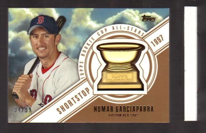
I was able to pick off these cards for 20-25 cents apiece.  I went with a few beloved subjects (NOMAHHHH!! and a catcher pose) and a few reviled subjects as well (Clemens, Palmeiro).  Overall, I think I captured a good mix of players and poses and it only took me 14 years to get around to it. 

I also read a blog piece recently (the blog itself escapes my memory, lemme know if you recognize your dilemma) that was very puzzled with the 2001 Donruss baseball set and what they did for parallels.
Photobucket
This page here is of the 2001 Donruss base cards.  This page has been in my binders for quite a while.  See, 2001 Donruss was their first baseball set since 1998 - I am not sure if their exile was self imposed or contractual - and it celebrated their 20th anniversary.  For the parallels, they decided to fill in those two missing years by making "2000 Donruss" and "1999 Donruss" cards.  I always found this odd and I can certainly understand some collector's confusion over the cards, especially 10 years after the fact.

I had, along with that 2001 Donruss page a 1999 Donruss page. 

A pretty sharp (and Indians heavy) page.  What I did not have was a 2000 Donruss page to go along with the other two.  Since I decided my Donruss pages would not be complete without it, I went to eBay again, but only found a large (and way overpriced) lot for sale.  Back to COMC.com again for me!

Since I still had the 1998 SP Authentics cards still unsent, it made sense to grab the cards I needed for the 2000 Donruss page as well.  This is what I came up with.
Photobucket
Once again, a nice mix of players and colors, and, as an accidental aesthetic choice, a lot of batting follow thru pictures.  I snagged these at 20-35 cents apiece with the Tony Gwynn costing me that big 35 cents.  I had never actually seen the 2000 Donruss baseball cards and I immediately recognized them...they copied the 2000 Donruss football set.  I have had this page forever:
Photobucket
Now, Topps used to, and in fact still, uses their baseball set as a tablet for their football design, and some card makers use the same design for each name plate brand for each sport (like Prestige or SP etc.).  But this is the first time I can think of that a unique and singular football set was the basis for a baseball set and not the other way around.  Can anyone else think of one?  You know, if you can even understand what the heck I am talking about.

Anyway, COMC has had a nice cheap bulk shipping option for the last couple months, so I might load up on some more neglected or ignored pages in the future. 

***
And as one final update, I recently showed the spoils of a recent new product buying binge.  Some specific cards were put aside and dropped in the mail this week.  Some of you know they are coming and some of you don't.  Anyway, rest assured, they are out there and on their way...
Photobucket
Right now, if anyone wants to reciprocate, I am desperately trying to get my hands on the two SP rookie cup cards from this years Topps - #158 Josh Reddick and #207 J.P. Arencibia.  I am also looking for the Dwight Gooden Mound Dominance insert from this year's Topps and the 1977 Gary Carter reprint and cloth sticker from the Archives set (plus his Gold Foil parallel). I am always dubious of people actually looking at my wantlist, so if anyone has any of these, please please email me post haste. Thanks!

Monday, March 12, 2012

Trade with Mark of The Chronicles of Fuji.

        I have a soft spot for player collectors.  I know from the madness they suffer.  I have dozens of player collections, in various shapes and sizes, and they are the last thing I have pared from my collection (the ones I am permanently and  psychotically attached to are listed in my Gotlist, take a look and let me know of there is anything you have I might want).

       When I see someone who has a white whale they are looking for and I can fill that need in my other areas of downsizing, it makes me very happy (ask Night Owl).  So, I came across the blog The Chronicles of Fuji about a year ago and recently saw that he had just three Steve Carlton cards he needed for The "Lefty" Project.  One of the cards was his 1965 rookie card and wouldn't you know it, I had recently come across a slightly off condition Carlton rookie in my piles of piles.  So, I scanned it and emailed him and we hammered out a deal.  I picked some cards from a list he maintains of trade bait (he is very organized; I am, um, not...) and we came to a fast understanding.  The following pictures shows the bounty I harvested:
Photobucket
The Nomar goes immediately into my player collection.  The Dewey Evans joins a page of Red Sox game used cards.  The Eli and Janssen will find nice spots in their respective team collections.  And the Mets, oh, those Mets.  I have a black Ventura from that Pacific set and now it has a dance partner.  And finally, with that Dotel Auto, I now only need the Piazza to have all the Mets from the 1999 SP Signature Edition - a seminal set if there ever was one.  That Piazza, however, is probably the highest priced of all his rare certified autographs and will remain in my white whale dreamland probably forever.

Oh, but Mark wasn't done.  He noticed my love of food issues and the Mets and included some awesome oddballs as well:
Photobucket
Photobucket
For working blind, he only got one card I already had (the Bobby Bo Hostess) and found one (the Hojo) I didn't even know existed.  Those Texas League minor league all star cards are a wonderful epitaph for the once mighty mid 80's Mets. That game used card in the corner? It was part of the original trade, it is of Max Sapp.  Yes, on top of all this, I am a Max collector as well. 

Like I said before, Mark is very well organized.  Our trade got a coversheet, for crying outloud:
Photobucket
and look at that...he has his own personalized baseball card! Let's see it up close:
Photobucket Wow.  Pretty frickin' sweet. I will certainly find a place of honor for that badboy.

Thanks Mark!

Monday, March 5, 2012

Genesis.

       So where exactly did this collecting idea come from?  Let's jump in the WABAC machine to the magical time of 1998 - Bill Clinton was president for life, the stock market would never ever fail again thanks to tech stocks, and The Simpsons was winding down its run, but still pretty funny.  I was living in Boston, and I had two jobs: I worked in a baseball card store by day and was an assistant manager of a record store by night.  It was my childhood dream jobs come true.  I got to talk baseball and buy and sell cards all day.  Then, I got to change into my cool clothes, talk music, flirt with cute customers, and bang cute clerks all night.  I worked 18-20 hours a day, but not a minute of it was remotely what I would call "work".  Alas, both of those stores are gone (though the card store exists in a different incarnation) and I no longer have the energy to run such a vocational gauntlet.  Oh, to be 23 again.  Anyway, working in the card shop allowed me to augment my collection exponentially.  I built vintage sets, scored choice hall of famers, and bought a fuckton of new product (it's an industry term). 

     Back then, most of my collection ended up in boxes but working in the card shop allowed me access to binders and pages at wholesale prices.  I started putting shiny inserts into pages.  At first, a lot of my pages looked like this:
Photobucket
Inserts all willy-nilly.  I mean, I have since moved these around a bit, but this page is almost exactly how I put together in 1998.

The first conscious effort I made to have nine cards on a page that had a unifying theme was this one:
Photobucket
I loved the '98 Finest, with the busy - but not ugly - ribbon design and the little icons for positions, a conceptual homage to the 1973 Topps set.  It was those icons that I wanted to showcase so I made sure they were all represented; I especially liked the batting helmet for the DH.  I even used the rarer shiny no-protector parallels.  This is it.  This is the genesis.  It became a harbinger.  I started to go back and see if I had nine of other inserts.  So more pages were made:

If I recall, this 1997 UD Great Futures page was second:
Photobucket
I loved these Topps Etch-a-Sketch inserts.  There were 9 of them in the set.  Perfect.
Photobucket

And so instead of this...
Photobucket
You got this:
Photobucket
Instead of this:
Photobucket
You got this:
Photobucket

Once I discovered eBay, it made doing pages like this much easier:
Photobucket
and much much more colorful:
Photobucket 
Sometimes much much MUCH more colorful:  Photobucket
Pound for pound, that UD Decade page might be my favorite page, like, ever.

So, from doing this with inserts came the natural progression to do it with all of my cards and collections.  That way I could narrow down some of the bulkier sets and player collections into manageable bites and focus on grander things that I actually wanted in quantity.  I liked the idea so much, I decided to share it with the world, or at least the 50 or so nerds like me who read dozens of card blogs everyday.


Saturday, March 3, 2012

Aesthetics.

       I was going to call this post "A for Aesthetics" but I want to keep this thing simple (and I would never want to endorse Sue Grafton novels, directly or otherwise).  Everyone seems to be down with the concept of this blog and I appreciate all the well wishes and encouragement.  But I also want to assure you all, there is more to all this than just slapping nine cards in a page and calling it a day.  Each page needs to not only represent the player, set, or concept, but it has to look good doing it.  At least, that is the goal.


Here is a page of Stan Musial modern retro vintage cards:
Photobucket  
All very different looking cards; some are very busy and modern, some are more staid designs and/or reprints.  All of them live together well on the page.  All the photos make sense where they are placed. 


Here is a page of Wally Joyner that illustrates this concept even better.  Different sets and photos all arranged well:
Photobucket

If he's looking up, he's on the bottom.  If he's looking right, he's on the left, and so on.  To look good is to feel good. Its got a couple of rookie cards and some OG Upper Deck in there too.  So in my binders, at least, Wally Joyner is the equal of Stan Musial, if not greater.


I do like the break up the monotony of page after page of player after player with some themes.  


Nomar is one of my favorite players of all time.  He has an astounding four pages in my retired binder.  I went with an all fielding page here:
Photobucket

I really like to do this with catchers.  As a failed former catcher myself (with the bad joints to prove it), I like to highlight the tools of ignorance, behold the recently retired Jason Varitek.
Photobucket

I do have binders that collect sets as well as players.  I find Allen and Ginter to be both awesome to rip open and collect, yet hard to work with in my nine card structure.
Photobucket

I mean, these '09s look nice, but page after page of similar looking A&G cards gets tiresome, so I tried to break it up with some bat-on-shoulder solidarity in '06...
Photobucket
...and some horizontally-oriented '07s.
Photobucket


I'll do this with players too.  I have two or three pages of Cal Ripken Jr. and since he has a little under a bazllion cards, I was able to cobble together a longways page:
Photobucket


I am certainly the demographic Topps is after with all their old timey sets and players, because I can't get enough of them:
Photobucket  
Though it is a sad statement that this is the least busy of all the Topps Triple Threads sets.

While I am on the subject, it is soapbox time.  I try not to complain too much about cards since this is my hobby and all, but I cannot ignore Topps and their recent quality slip.  It is not just the monopoly that has led to this sad state, they were well on their way down before that.  I have a fantastic example here.  These are the 2002 Topps 206s:
Photobucket

Great pictures, well colored, the subject pops off the background, high quality stuff, pays homage to the original set, looks great.


And these are the 2009 Topps 206s, a mere 7 years later:
Photobucket  
Mediocre pictures, horrible photoshop effects, awful over saturated backgrounds, inconsistent and lazy coloring of subjects, looks like a high school art project...and what the hell is going on with that Lou Gehrig?  He had ALS, not Down's Syndrome. Whatever happened in those seven years, design and quality control took a long looooooong step down. 
 
/soapbox


As a palate cleanser, here's one more good example, from the HoF binder; Goose Gossage in all his goosey-ness, lots of teams represented, lots of sets represented, mustache very well represented, the pictures all nicely arranged:
Photobucket


And here...well, here is one of my Hank Aaron pages, it's all over the place...
Photobucket
...it needs a little work, though Night Owl should appreciate the original well-loved 1975 cards from my brother's collection.  

       And to those who asked, I will be working on the wantlists and gotlists sometime this weekend, or next month, I am in no rush, but thanks for inquiring, I am aware they need to be posted.  And once again, thanks to everyone who has come to look at my little blog and especially those who have taken the time to comment.