Showing posts with label design flaws. Show all posts

Wednesday, February 7, 2018

Sorting things out.

       A few leftover notions from my 2018 Topps post from Sunday.

I spoke of the look of the new flagship set and while I don't hate it as much as I have 2017 or 2016 since Topps has gone to a borderless design, they have started to take on the vibe of late era Donruss base cards and this is not necessarily a good thing.  I think one thing that always made Topps special is that they had a specific feel and natural progression and the border is one of those things that now seems is lost. I feel this year's design, unlike the last 2 years, would look great with a border.  My awesome, utterly professional and in no way amateurish photoshop skills came up with this:


You can add a border and they look much more like classic Topps cards (think 1996 perhaps) and if you need to have things extend out a bit, you can see I took the ribbon to the edge of the card and continued the disintegrating name plate into the border as well as the team logo (where applicable).  I am sure somehow Topps thinks borderless cards are all "futuristic" but they have been around since 1990-91 and used on regular base cards since 1994 Donruss and Upper Deck.  I am not sure those are touchstones to be aspiring to. Flagship Topps always had a classic look and they seem to love to celebrate their history, so why have they turned their back on it the last few years in the name of "the future?"

***

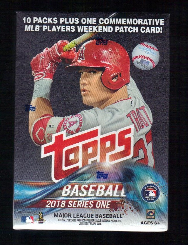
We all recognize what this is:


I have collated cards for as long as I can remember yet I have never given it much thought.  I don't know if it is like scoring a baseball game but I suspect a lot of people have quirks to the way they do it, as I have seen folks in card shops and at shows do it their own way.  If I have a few dozen cards, I just do it in my hand like shuffling a poker deck.  If I have a few hundred, I sort them as you see above, into blocks of numbers of 50, e.g. 1-49, 50-99, 100-149 etc.  Then I sort them further.  If there is a few thousand to do, I so the same thing, then break them down into the 10s as I do it and then hand sort.  It is a monotonous activity but I have always found something relaxing and a little zen about it.  When I was a kid, my mom referred to it as me "playing solitaire" (which I supposed when you are 10 has a whole different meaning than when you are 15, but I digress).  And this is just numerically.  Anyway, does anyone have any different way they do things?  Let me know since I am momentarily obsessed with whether there's a whole different system I have never been privy to.  Not to mention there is also the classic 8x4 grid of sorting things by team, another issue all together.  I always do the teams alphabetically but maybe you do them by league and/or division?  I must know!  

***

And finally, a wonderful bit of card serendipity that I am sure we've all had or hoped to have at one time or another.  As I was searching for the new Topps on Friday, I was also meeting a friend for coffee at a Dunkin Donuts I don't normally go to.  I was a little early and there was a comic book shop next door, so I ducked inside there to kill the 10 minutes I had to wait.  Now, I am not comics guy but I can always enjoy a comic book shop just for the nerdy vibe, the toys, and there's always a chance they have some sports stuff stuck in among their wares.  They had a few long 5000 count boxes full of MTG and Pokemon cards and the like but then my eye caught the unmistakable dull gray cardboard color that can only be vintage Topps cards.  There was only a couple hundred of them, but what a vein of joy it was.  They weren't in sleeves or priced but going through them, there were some I just had to have...


How often does a coffee date turn into 1975 Topps?  More than that, was some of these...


I love the 1973-74 hockey design and there are a couple of wonderfully miscut ones as well.  So I only had a few minutes with these cards and I had no time to go through them all.  These are the few I nabbed while I was there initially.  When I went to check out, the n̶e̶r̶d̶ dude behind the counter said, "oh, anything in there without a sleeve is 10 cents"  I had lucked into a 10 cent vintage box in the middle of Wayne NJ on a Friday afternoon!  I had my coffee and caught up with my friend, and then you better believe I marched back into that shop and bought just about every one of those cards that even remotely interested me.


All because of my efficiency in finding the new Topps and over-promptness in meeting my friend, I now have a few hours of bliss ahead of me this week.  Oh, and I also have this:


If you need an explanation, I don't think we can be friends.

Sunday, February 4, 2018

Ride The Waterslide.

       Seeing as I have little to no interest in who wins today's Big Game (aka Super Bowl - sue me!) it seems as good a time as any to break out the new Topps.  I stopped in two Target stores only to stare at bare shelves full of old, picked-through 2017 product and it was only serendipity that led me to cut across a parking lot to a Toys R Us to go looking for the new stuff.

There I found blasters and hanger boxes and seeing as it was Friday and I had some money burning the proverbial hole in my pocket, I bought one of each. 


I assume Topps has Mike Trout under lifetime contract since we get to look at his mug on the packs yet again and I am surprised Aaron Judge isn't here - maybe series 2.  One thing I am amazed at is the now incredible amount of odds and legalese that accompanies baseball cards.  It literally takes up the entire back of the hanger box:


Enough of the packaging, let's take a look at the cards. When this set was previewed last fall people immediately seized upon the 3D ribbon on the bottom of the graphic and referred to it as the Water Slide Set.  I think it is Night Owl that keeps track of "official" nicknames but this one was a no brainer.  If only it twisted in on itself a little, it could have been the Mobius Strip Set, which would be as good a name as the Psychedelic Gravestones IMO.  I'll have more on the design in a later post, though this is a great improvement over the last couple years.


As the name of my blog hints at, I tend to view sports cards nine at a time and this is the page I made from the 20(!) doubles I got in 172 cards.  Since I bought 2 different boxes I guess that isn't terrible collation but hardly optimal for the set builder (full disclosure, I am not building the set).  The real disappointment was that I only got 3(!) Mets cards out of all those cards.  All things considered, statistically, I should have gotten 5 or 6.  Luckily Amed Rosario was 2 of those cards.


These are some more cards that are staying in the collection: rookie cups and World Series cards, and of course a couple of my birthday boys, Garrett Richards and Yoan Moncada. Not to mention a couple of dudes that are tastefully named. The rest are for player collections or other such things.


This is just about all the cards that are staying in the collection this time around.  Not an inspirational haul but part of the joy of this time of year is the opening of the new flagship as a reminder that spring and the season are just around the corner.  Good thing to since it is cold as fuck this weekend and this Superb Owl has me rooting for the meteor strike.  In the name of completeness, let's look at the inserts that Topps inundates us with:


This is Year 18 of the gold parallels, they are now old enough to vote.  I am always fond of the shiny and that McCullers is a rainbow foil parallel; alas my scanner didn't quite do it justice.  Topps has a new contest that is convoluted as it is uninspired.  It involves scratching things and home runs hit on certain dates and in the end winning a trip to the 2019 Home Run Derby.  The fine print is what you're going to get is an all expense paid trip to ClevelandWonderful.  Also seen here are the opposite ends of the insert spectrum, the Superstar Sensations which features players in glorious swooshes of purple and sparkles, and then MLB Award winners, a well-worn concept drably presented in what looks like a design that was rejected last year with all it's bad negative space and jutting angles.


On the top row we see the Salute cards again, in what looks like a rejected design for this year's flagship set; I had a hard time picking them out during my sort.  I am not sure if presenting 100 different cards in a bunch of different subsets reeks of overkill or laziness.  That is not high praise.  Speaking of lazy, Topps also has a whole insert set here titled Opening Day.  Given the design, why not something with "Wall" or "Bricks" or "Foundation" or some other cliche rather than the same name as an entirely different set they already release.  *sigh*


I ruminated last time around if the 30th anniversary milestone would be a touchstone for a design reprint insert.  I was wrong because this time they are going with 1983 as a 35th anniversary.  Topps really does love to congratulate itself on its own history.  But between Archives and Heritage, these are overkill to the extreme.  We just got 1983 in Archives a few years back anyway.  Since they insist on reusing all their old nostalgic designs, I wish they could/would use Archives base cards to highlight subsets or odd vintage inserts rather than flagship designs, or even other sports designs applied to baseball, as they have done before for inserts.  This could mix things up a little and they have done it to interesting results for their WWE Heritage sets.  Also above you see a set called Legends in the Making and they are exactly what you would expect from that bland moniker, a rehash of young stars and highly touted rookies presented in some splattery computer design that looks like something Panini would reject.  Am I wrong in thinking Topps would be better off focusing on a few excellent inserts with nifty designs rather than a bunch of rehashes and rejects?  That or since this is the flagship, just keep parallels, inserts and short print variations to a minimum and focus on the base cards.  I know, this is crazy talk.


Speaking of which, last but not least here you see my promised manu-patch card from the blaster.  I really liked the idea of Players Weekend, with the funky jerseys and nicknames on the back of uniforms.  I think it would make a splendid topic for a well done insert set.  Instead, Topps kind of throws the idea away without bringing it to full fruition and giving it the attention it deserves.  They don't focus on the nicknames the players used at all and use the same "patch" for every card.  They at least did come up with a photo of Miguel Cabrera in the uniform the Tigers used that weekend.  It really makes you wonder who's making decisions over there.  

Most of the cards here are available for trade (think from the gold parallels down) and I have a whole list of cards (in comments) if you need to fill your want lists. Be warned, these cards are destined for eBay so act quickly.  I am looking for the Mets cards and inserts and will gladly trade for them as I didn't get very many, as I lamented before.  Drop me an email or comment if you're game for swapping.   And now, back to hour nine of the SB pregame show.

Monday, April 3, 2017

First Things First.

       Ah, Opening Day.  There is nothing else like it.  Except, well, it is now stretched out over a few days so I guess MLB should just trademark Opening Few Days and get it over with.  But enough with the awful march of commerce, let us embrace the wonderful march of time.  The sun is up, the sky is blue (etc.) and the Mets are out in Flushing adding to baseball's best record on Opening Day.
 photo untitled2_zpsnspysua4.jpg
This year at CitiField, the ceremonial First Pitch was very emotional.


My favorite meaningless statistic is that the Mets are now 36-20 on opening day, the best percentage in baseball history.  Also quirky - and often pointed out - is that they won a World Series (1969) before they actually won on opening day (1970) which means they are 36-12 since that Miracle happened.  Fascinating and stupid.

On a more card related point, this is what the 2017 Topps page ended up looking like:
 photo untitled3_zpssydlbepp.jpg
I am still not crazy about the design and it has yet to grow on me.  That along with this year's Heritage being the burlap abortion that is 1968 Topps, I am not in a collecting happy place right now (and let's not even bring up that Panini decided that the 1990 Donruss design needed to be brought back, ugh).

I did, however, follow through on my threat to tweak the Salute inserts into a better looking base design:
 photo salute_zpscrqquv6v.jpg
My photoshop skills are weak at best, but I think by making the photo a tad larger by dragging out the half-border and replacing the insert title with the position, you have at least a good starting point for a much better and cleaner design than the inception angle boxes Topps gave us this year.  With a little more skill and time, I am sure the gold stripe could match the team colors and the city name in that right border could be something else as well (though I kinda like the half-font thing going on there).  But this is what I was driving at when I critiqued the 2017 base design and in a rare instance, I don't think I am crazy or wrong here.  What do you think? Has anyone else done something similar recently?  Let me know since this is the first year I have been that turned off by the Topps design since I started the blog.