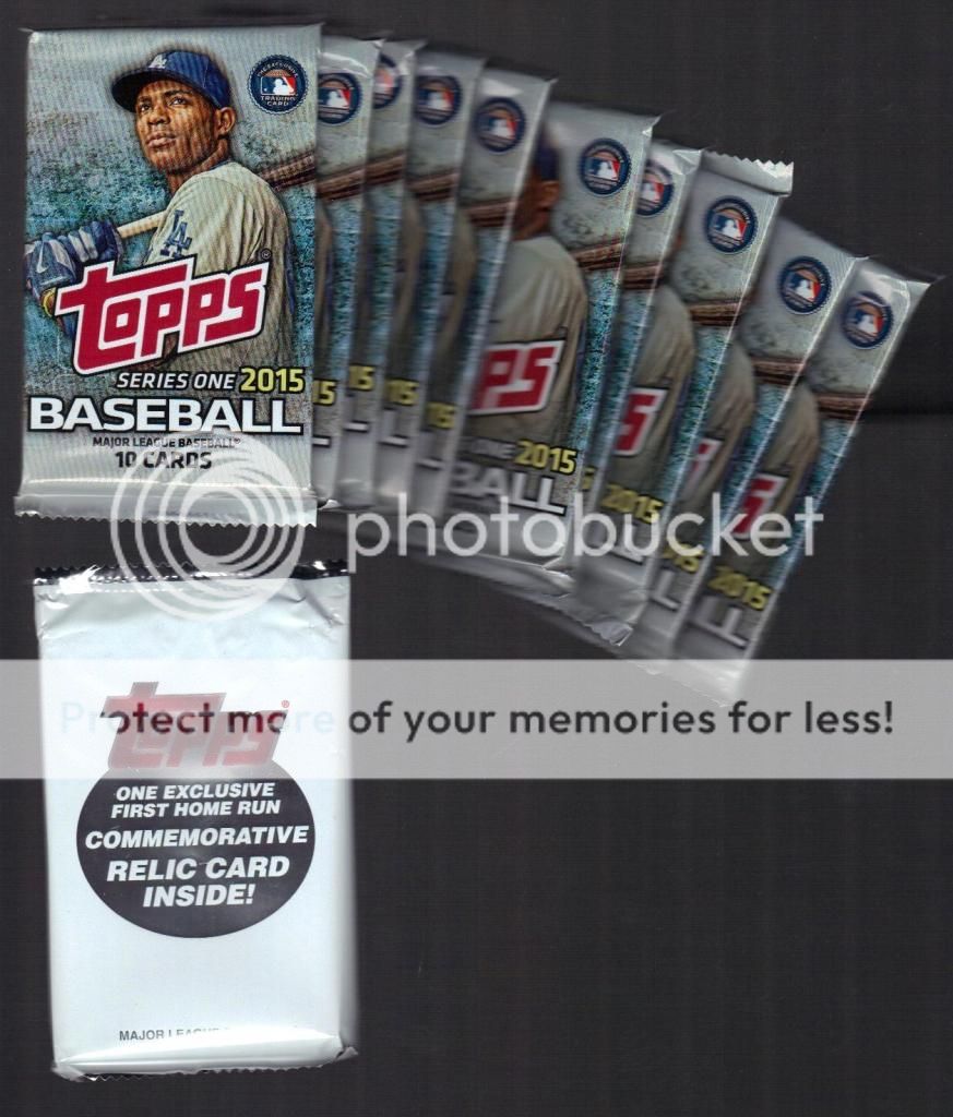
So while I am a little late, lets take a look at the new 2015 Topps.

My blaster came with ten 10-card packs and a little manu-patch pack as well. I had seen some previews and reviews of the new flagship offering, but I like to wait until I have them in my hands to formulate an opinion.

Well, they certainly are colorful. But even with all those bursts of color in the borders, there is a cleanness to the design. No extra waves or flourishes like last year, just name, position, logo. Sure, the little graphics in the color splashes looks like something out of Upper Deck circa 2002, but hey, what can you do? It's not too boring and not too busy; Goldilocks would eat this design.
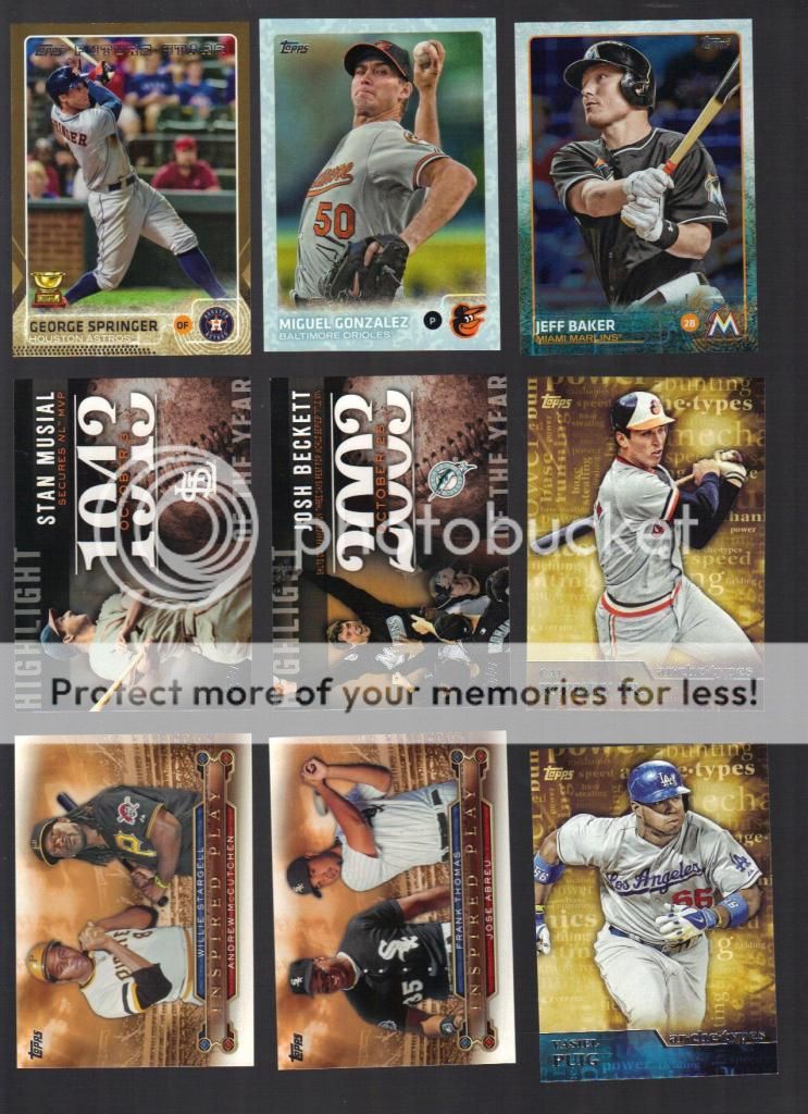
There was some parallels in there, of course, and I like them. They jazzed up the obligatory gold parallel a little for a change and though you can't see it from the scan, the one in the middle is called Snow Camo, certainly more than a little different. The one on the right is a rainbow foil, sort of a discount refractor but reminiscent of the 1995 Cyberstat parallels that I am so fond of. I'll need to put together a page of those shiny badboys. They also seem to have eliminated the store-based rainbow of parallels, a most welcome addition by subtraction.

The inserts are a predictable range, one with yearly highlights, creatively named Highlights of the Year, a then-and-now type set called Inspired Play, and some current and past stars mixed together in a set called archetypes. I am keeping the Frank Thomas/Jose Abreu card, but any of the others here are available for trade.
Let's go a little deeper into the base...

I think this design actually works better horizontally. It allows the texture in the color border to breath and opens it up a little.
They expanded the base set to 350 cards, giving Topps more room to add players and concepts, and yet they seem to have stuck to the template they have used for a while in terms of subsets.

The leader cards are top-three across, the checklists have stars' seasonal highlights or milestones. Plus, since I am picking nits here, I can see squeezing another last Jeter card into the set, but is 2500 hits something that deserves mentioning? Garrett Anderson and Steve Finley didn't get cards when they recently reached the big 25-0-0. Topps is weird.
Topps thankfully didn't include a theme as they have the last couple years, but they continued and seemingly expanded the Future Star designations from last year. I noticed the All Star Rookie Cup cards all have the Future Stars logo on top and it clutters up the works, in my opinion. I think the handsome little cup deserves the spotlight all to itself.

The rookie logo celebrates it's 10th year on the flagship and Topps continues to release Bowman every year, making that logo completely useless.
Okay, one last thing before I go. With all the color flying around on these, you would think Topps would mix up the photos a little...

...and you would be wrong. One thing I have noticed, at least from the 100 cards I got, is a bland sameness to the photography...lots of pitchers mid-motion from the waist up...
...and lots of hitters in their follow through from the waist up.

Lots and lots of them. It almost makes me long for a few goofy "candid" portraits with the cap off, or maybe I am just getting old and jaded. Plus I can't tell if there is too much photoshop going on in the quality of the pictures or if the border just makes some of the presentation look too busy. It's not quite the cropping and quality nightmare of the 2008 set, but this is definitely a step down from the last couple of years, picture wise.
Oh, and I got this thing.

My manu-patch card, which is actually a manu-coin card, is a big bust. It holds no appeal to me, and since Heyward was traded from the Braves late in the off season, it will probably garner little attraction to either Braves or Cardinals fans. *sigh* some kid in Atlanta no doubt opened his blaster and got a David Wright and is just as pissed off as I am.
Last but not least, Topps is running one of their epic contests and I got a card for it.

I haven't scratched this thing as I am not interested in such nonsense, but it anyone wants it, drop me a line and I'll send it along. I think I can see enough of a chance of spring that I might even answer your email.

3 comments:
I would take that scratcher off your hands if it's still available.
Glad you're back! I'm with you on this set. At first, it's nice that it's not all white bordered nonsense, but the photography is repetitive and bland.
I do wish the photography would snap itself out of the funk it's been in for at least the last 4 years, but the borders are so, so, so, pretty.
Post a Comment