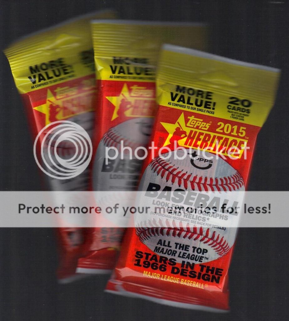
Last year saw Topps do one of my absolute favorite sets of all time, 1965. This year finds us moving on to the next year, 1966, which is one of the more blasé designs of the 60's, second only to the absolute yawn-inducing 1961 design.

I wonder if anyone actually pays attention that Topps Heritage makes the point of making the modern packs the same style of the vintage ones. I wonder if anyone outside of the blogosphere actually cares?
Out of my three packs, I got two all star rookie trophy cards, this is the absolute highlight of these base cards for me. I also got one other Mets player, who is now a former Mets player.

One thing I do enjoy is some of the little things Topps does, like include manager cards. Also making combo cards that somewhat reflect the ones in the original set. I (and others) have screamed ad nauseum about the superfluous copyright information on the fronts, so I am just going to (try to) ignore that for now. I also noticed that the team cards are not the normal posed team photos that have been used forever on such cards, both modern and vintage, but are field action shots, mostly of celebrations. This switch up in Heritage mirrors the team cards in the base set. I am not 100% sure I like this twist since they do the team cards in the base sets the same way; it would be reasonable to use the classic posed shots for Heritage. Maybe teams don't pose for such pictures anymore? I am torn.
Topps did the multi-player rookie and leader cards in similar style to the 1966 set as well. I had to look up if they all used black borders and low and behold, they do. Good on you Topps, for getting that element correct. One thing they did not do back in the day was put two team names on the front of the rookie star cards, they lumped them into league banners. I am okay with this slight stylistic change.

They are doing the usual action photo variations, along with some other good (trade lines on back) and bad (color swaps on front) variations as well. I commend their photo selection overall, it reflects the mostly posed and sideline candid style that the mid-60's cards always had. They also did a lot of them at spring training, which is also a nice touch. You get a lot of palm trees and minor league looking advertising backgrounds, which is fun.
After looking over the 60 cards I got in my packs, this is the page I came up with:

Why these nine cards? They captured the essence of the vintage set while having some nice modern touches. Plus, there are some cool things going on in most of the pictures, like light towers, trees,, missing afros, and teams that didn't exist in 1966. Not to mention they all have beards to tie it all together (and match my glorious facial hair).
While we are talking about the photos and their overall aesthetic, let's look deeper at a few of the quirks and minutae. I have 20 minutes to kill here.

I like how it is pretty obvious that some teams just lined up at spring training and got their photos taken. That's how you get the same light stanchions, chain link fences, and blue skies in the background.
Oh, those blue skies.

Is the White Sox spring training facility near a park? This is the second year in a row I have noticed that pretty tree line on their cards.
If I was a baseball player, I would be very self conscious of photographers because it seems that no other sport lends itself to more goofy candid faces than the grand old game.

Seems that dude in the Angels dugout was working overtime. And the Cabrera card looks like the photog snuck up on him and said "hey Miggy!" *click*
Alright, it seems I have scanned just about all the cards I pulled, a rarity, so let's pull the Gilligan's Island Theme trick and do the rest.

I did get a couple of high number short print cards but it seems that any inserts or variations were lacking, that is until I got to the last pack, when I pulled a rare two-fer. Seems those two Then and Now cards were stuck together, literally. There was some kind of goo on the back of the Koufax/Price card, giving me Killebrew/Santana one as well and a grand total of 61 cards in three 20 card value packs. Too bad this couldn't have happened with the low numbered autographs.
Okay, they are singing the national anthem in DC, so at last it is time to Play Ball!

2 comments:
Manager cards might be the best thing Heritage has going for it. I wish they'd return to Flagship, but I guess I can't complain too much when Heritage is around.
Happy Opening Day!
Not a big fan of this year's Heritage... although the manager cards are a nice touch. I also enjoyed a handful of cards with cool cloud/tree backgrounds.
Post a Comment