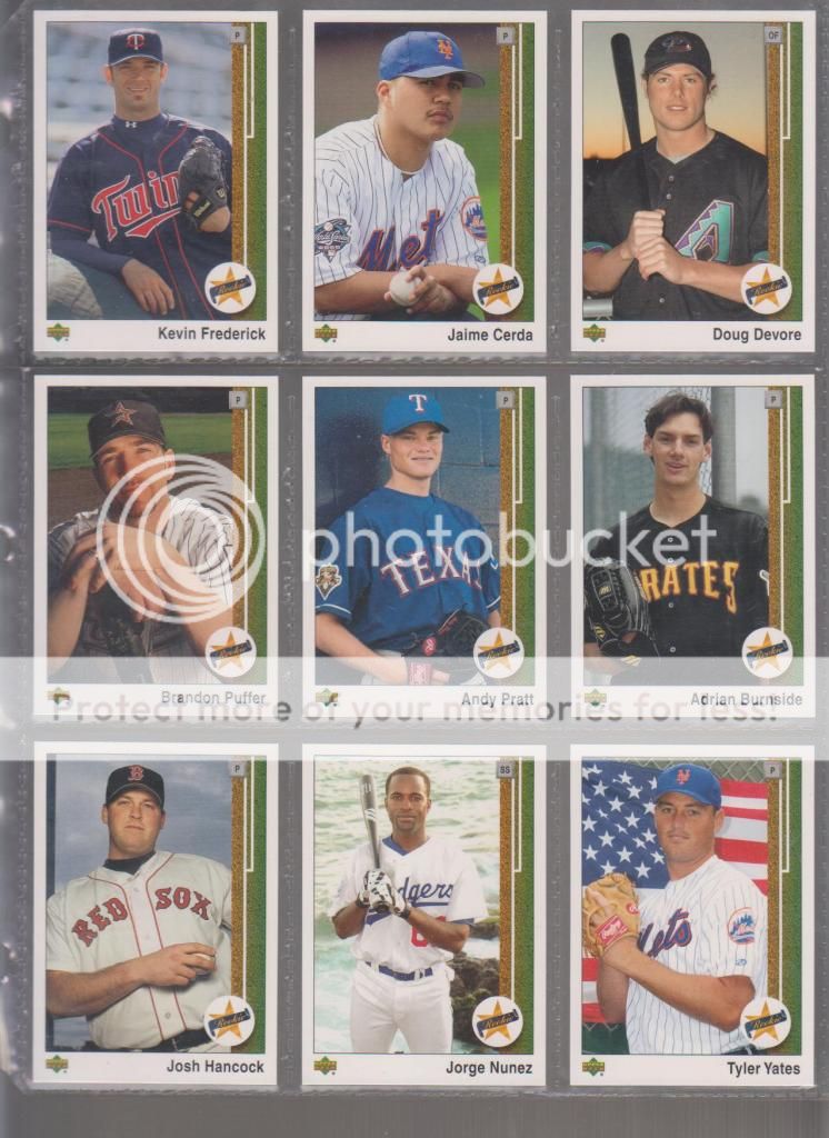
In my set binders, you will find the ultimate piece of forced nostalgia Upper Deck has given us, the 2002 UD Authentics set. Upper Deck went all out with this bad boy, giving us not only the exact design from a whole 13 years back (perhaps they felt this set was their company's Bar Mitzvah?) but they also gave us the packs and boxes that emulate the 1989 look as well. First, let's look at the fronts:

I must say, it looks great. They got the design perfect and the fonts dead on (something Topps either can't or won't do). The pictures were typical sharp Upper Deck photography, though they do lack the rare injection of quirkiness the 1989 set had, and are pretty heavy on action shots.

One very odd thing they did with this set was order the cards by teams an alphabetically, which is more of a Fleer convention than an Upper Deck one and something they did not do with the 1989 set, though UD did tend to do this with their smaller satellite sets at the time this set came out. There is also a lot of traded lines with new logos but without updated photos. I guess their photoshop sensibilities were not honed sharp at the time.
Let's look at the backs:

The backs are also pretty spot on for the look of the 1989's except for a couple obvious issues. First, the abundance of obligatory and obnoxious extra logos, disclaimer, and copyright info (which totally takes away from the photo). Second, and most important, instead of listing 5 years of stats, they listed only one year and gave each player a little write up. Since they were already truncating the stats, I guess this isn't a big deal, but it is the biggest difference in these from the 1989 backs.
Like I said, lots of action shots:

Remember 2002 when all the Mets cards had to have shots of them wearing their post 9/11 NYC hats? Remember when the White Sox were on the forefront of retro jerseys? Remember when Jose Canseco was just hanging on? Remember when Roger Clemens was an ageless marvel and a first ballot hall of famer?

Remember when the signing of Jason Giambi was something for the Yankees to be very proud of? See? Isn't nostalgia wonderful?
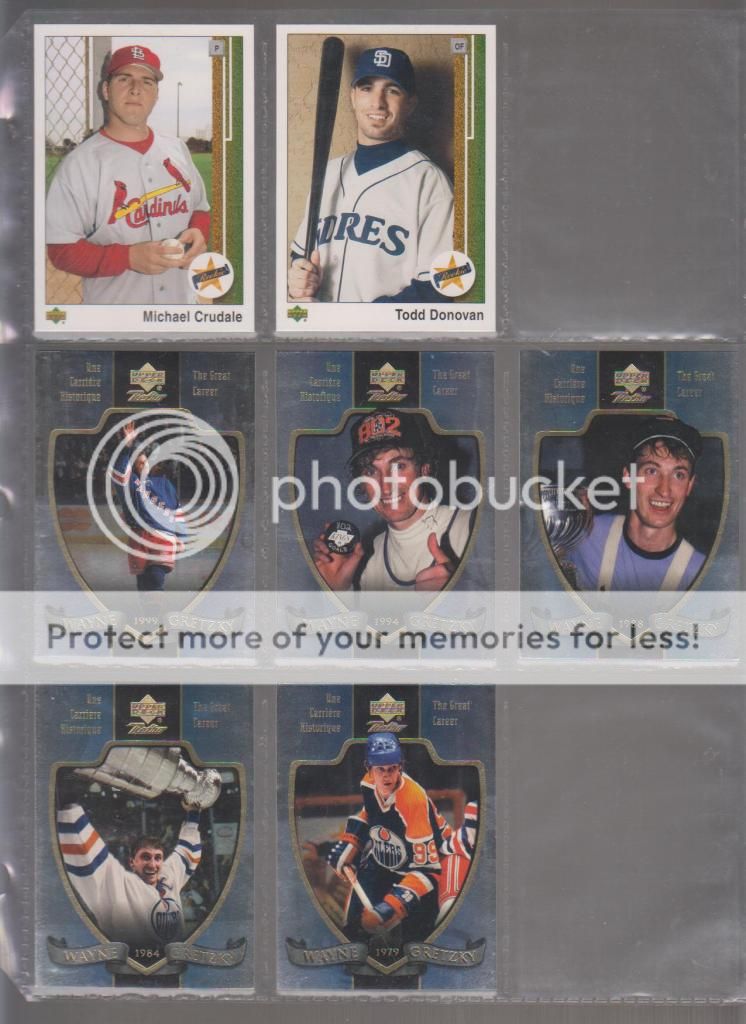
The last 20 cards of the set are the Star Rookies, which once again are very nicely emulated from the 1989 set. The rookies are all in posed shots, instead of action shots.

Too bad they picked 20 of the most nondescript and unknown rookies possible. I mean, I had never heard of most of them and the ones I had heard of were pretty terrible major league baseball players. I guess since they weren't short printed and serial numbered, Upper Deck didn't give much of a damn in selecting them.
One other thing about this set that grinds my gears is that it is a 200 card set. That means a 2 card hangover in my 9 pocket pages, which in my world is just about the most awful thing ever. I filled in the space here with a five card Wayne Gretzky insert set, which I believe is a companion to this set which I covered earlier. Why it is here and not with that set (which is in a completely different binder) is beyond me and shows my mystifying organizational skills.

One neat thing about that Gretzky set is that the prefix to the card numbers is "GR81-" which is just outstanding. I should probably put it back where it belongs.
The packs of this set had the usual serial numbered star inserts and game used jerseys and such, but the parallel set was a little different and was somewhat inspired if hamfistedly executed. The 1989 Upper Deck set was known for a couple of rare error cards which were caught early in the print run. The rarest of these is a reverse negative Dale Murphy card, which is still sought after by collectors today. So, knowing that...

...look at this page of cards - a random selection of 9 of the cards from this set...
...now look at this one...

Hey! Look at that, they are the reverse negative of the first page. That's right, the 2002 UD Authentics set's parallels were a reverse negative set. This would be pretty awesome if not for one glaring weakness: the team logos are airbrushed out of the reverse negative card. I have no idea if this is aesthetic choice on their part, if it was so you could more easily tell that this was the reverse negative card, or if there is some kind of clause in their contract that says they couldn't show the logos that way - whatever the reason, it is there and it ruins the whole effect. It is not too bad on some cards, like the Martinez or the Sweeney, but it is distracting and ugly on most of them, like the Washburn and the Mondesi. It makes them look like unlicensed oddball food issues rather than like the epic parallels they should have been. In fact, this whole set could be filed under "what might have been." Look at that Nomar card to get what I am hinting at - this parallel set could have been so damn cool. I would have happily put together the parallel set for this set if not for the logo thing.
I bought two boxes of this stuff at the time it came out, probably out of a need to open something new and out of the aforementioned fit of nostalgia. There should have been some magic in this set. Either in finding a rookie like the Ken Griffey Jr. that opened the 1989 set or in chasing a quirky and unique parallel set. But, sadly, the set just falls flat. I put it together at the time from those two boxes and I somehow, it wound up in my set binders. Perhaps I planned on pairing it with my 1989 Upper Deck set, which at one time I wanted to put into pages but ended up selling instead. I wanted it to be so good when it came out and it fell so short. Unfortunately, there is no nostalgic glow in looking at it again 10 years later. If anything, time has accentuated its ugliness and flaws - don't tell me you can look at those reverse negative parallels and NOT think of the horrid 2010 Upper Deck set - and it will take a long time to ever look at this set as anything but ugly and flawed.

1 comment:
I'm one of those that doesn't look at '89 UD with nostalgia at all. Never cared for it (and never heard of the '02 reverse negative set until you sent me a card from it!)
Upper Deck is/was a cynical card company for a cynical time, which is a reason why I enjoy Topps more. Not to say that Topps didn't get cynical. But at one time they weren't.
Post a Comment